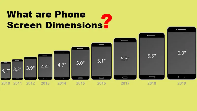
According to the current era, many devices through which people can pick. Though, when designing websites and mobile devices, it is highly important to be aware of some effective phone screen dimensions and resolutions. Hence, it can fulfill the design of your viewer’s screen. An enhanced, approachable website gives you easy space to use, and that ultimately grabs the attention of the users in no time.
Coding for different Phone Screen Dimensions
It can be almost impossible for companies to plan each device separately. Instead, developers often group open projects:
Here, you will be having a Group style through which it depends on the most common sizes for phones, tablets, and desktops, In general, a screen size which is higher than 7 inches is characteristically displayed with a desktop resolution or Use breakpoints (defined by the width of the pixels, that the display will regulate as per the actual screen size) liable on the design and location.
What does the developer actually do?
Occasionally the developer will combine both methods if they want to represent such. It is always recommended that, start by grouping the typical device sizes.
If at all you are a developer and need to generate the styles required to work with mobile or responsive styles, just include the fragment of CSS below that may support it.
Note: It is highly required to note that these breakpoints are not fixed for all sites and must only be considered as a guide to get initiated.
For Example – Typical Device Breakpoints[CSS]
/* Extra small devices (phones, 480px (or) 600px and down) */

@media only screen and (max-width: 480px) {

  .example {color: green;}

}

/* (480px or 600px) */

@media only screen and (max-width: 600px) {

  .example {color: yellow;}

}

/* Small devices (portrait tablets and large phones, 600px and up) */

@media only screen and (min-width: 600px) {

  .example {color: red;}

}

/* Medium devices (landscape tablets, 768px and up) */

@media only screen and (min-width: 768px) {

  .example {color: blue;}

}

/* Large devices (laptops/desktops, 992px and up) */

@media only screen and (min-width: 992px) {

  .example {color: violet;}

}

/* Extra large devices (large laptops and desktops, 1200px and up) */

@media only screen and (min-width: 1200px) {

  .example {color: gray;}

}
Phone Screen Dimensions vs Viewing Area
If at all, you purchase a device, Ensure with both screen size and the resolution mentioned as per the specifications on any particular brands. Eventually, screen sensitivity is the transverse measurement of the screen crossways in inches. Hence, this must not be a confusion with the resolution, where the number of pixels on the screen might be displayed in terms of width in height (i.e., 1024×768).
When you have devices of the same screen size, you may find difficulties in different resolutions, developers might use display windows during the process of generating an easy-to-use mobile page. Viewports consist of smaller versions of the resolution, which permits you to view websites on various devices more reliably, gives you more standardization, and has a lower resolution than resolution.
Though desktop and laptop monitors are straight (higher), many mobile devices might be rotated to display sites in a horizontal and vertical orientation (higher than width). This shows that the designers and developers might have to design with these variations. On the other hand, make sure the desktop and laptop monitors are horizontal (higher), and various mobile devices can be rotated to display sites in a horizontal and vertical orientation (greater than the width). This represents that designers and developers should need to design with these differences while manufacturing.
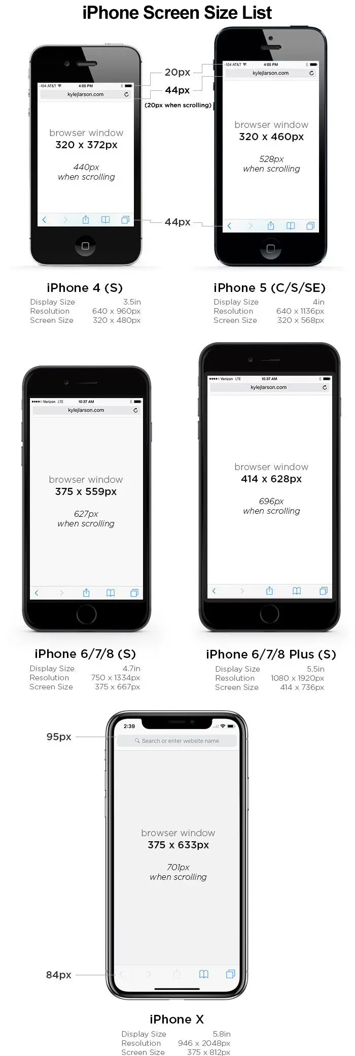
For Example: Some Apple iPhone Screen Dimensions List
Latest Phone List With Screen Dimensions
FAQ’s
What is the most common smartphone size?
Here, we have effective or common Mobile Screen Resolutions In The US
- 414×896 (19.44%)
- 375×667 (13.67%)
- 375×812 (12.3%)
- 414×736 (8.91%)
What is the largest cell phone display?
Whereas, Samsung unveiled its Galaxy Note with a huge 5.3-inch display, that can be claimed as the world’s largest smartphone screen.
Reference – Wiki